
To Scroll or Not to Scroll -- New Trends in Web Design
As computer screen sizes and devices have evolved, web design has adapted to offer an improved user experience. Responsive design was developed as a method of web design to build sites that will display properly on smartphones and wall-mounted wide screens alike. With responsive design, content reassembles and adapts to fit on the screen to be readable without requiring the user to pinch or zoom.
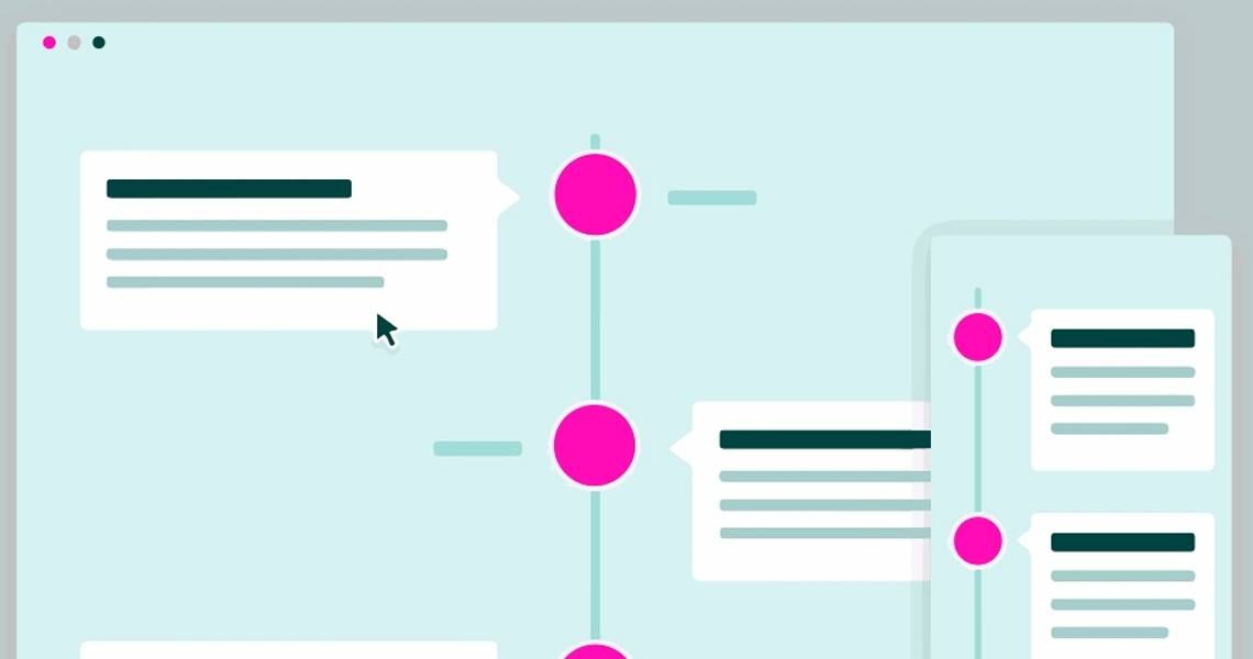
Most recently, the trend in web design has been to offer content navigated through vertical scrolling, which eliminates the need to click to load multiple pages to view content. This change reflects a turn-around from years past when “above-the-fold” was key – everything you could immediately see on the page without having to scroll was designed encourage clicks deeper into the site within 7 seconds. With responsive design, the top of the page continues to be critical, but scrolling is intuitive and nowadays, quite acceptable.
Navigation / Menu Systems
On smartphones and tablets, navigation is done by touch rather than mouse clicks. This necessitates sufficient spacing between pressure points to accommodate fingertip widths. This change has brought about variations in menu designs.
Overlay Dropdown Menus, Sidebar Transitions, Tabs, Toolbar, etc.
On touch devices, familiar website hover effects don’t work. With that in mind, in an effort to keep things clean and simple, fewer menu options are a common approach for the mobile view. Formats can vary, depending on the audience and how many linking pages are needed. Widely used options include dropdown menus displaying over content areas, sidebar link lists, footer lists, and tabbed menus.
And then, there is the Hamburger Menu…
A hamburger menu looks like a list comprised of three horizontal bars. It is primarily used to save space on the smaller screens of smartphones and tablets. There are advantages and drawbacks to the hamburger – the main concern is that in its default state options are hidden, so it requires a click to discover what topics are available to learn more. The advantage of using a hamburger menu is that it neatly stays out of the way, keeping the page design clean, expanding when needed.
What is Parallax Design?
Parallax Design is a popular visual effect used in web design which creates an illusion of depth. When scrolling down the page, the background imagery behind content blocks is animated to move at a different speed than foreground content (consisting of text blocks and images). The result offers creative options for user interactivity. Without immediately clicking off the homepage, Parallax Design is often used to guide visitors through a long, scrolling page for story-telling purposes.
While it can be visually interesting and entertaining, there is a downside with a slower load time; it should only be used when there is a benefit worth the cost. Parallax scrolling requires a JavaScript that can be processor intensive, slowing down a computer or mobile device. Secondly, lengthy scrolling pages can sometimes have a negative effect on SEO.
Prioritizing Content for Responsive Format
On smaller screens, there is less screen real estate available to present content. In addition, choosing a design that can be easily rescaled can sometimes be a challenge.
Determine what content is essential to communicate your message, and what can be left out to keep it user-friendly on a mobile device. Content will be reorganized so it displays vertically, but given space considerations, it’s best to cut down on wordiness to avoid information overload.
Responsive Web Design goes beyond having a site that looks good on different screens -- it is a form of design that makes it far easier for visitors to use your site, regardless of if it’s accessed from a computer, tablet, or smartphone.